コード
解説
はじめに
この記事では、matplotlibを使用してドーナツ状の円グラフを作成する方法について解説します。通常の円グラフに中央の穴を追加することで、データの視覚的表現を向上させる手法を紹介します。
モジュールのインポート
データの生成
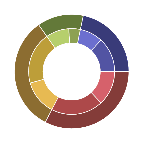
(4, 2)形状の適当なデータを生成します。
色の設定
tab20bは、

color example code: colormaps_reference.py — Matplotlib 2.0.2 documentation
matplotlib.org
のQualitative colormapsに含まれており、同系色が4色ずつ連なったカラーマップになっています。外側のドーナツには0から4つ飛ばしで色を選択し、内側のドーナツには1・2個目、5・6個目、9・10個目、13・14個目の色をそれぞれ選択しました。
ドーナツグラフの表示
vals.sum(axis=1)を使用すると、np.array全体ではなく各行(array内の各array)の合計を計算できるため、4つのデータ値が得られます。一方、vals.flatten()はnp.arrayを1次元配列に展開するので、8つのデータ値が得られます。
colorsパラメータによって、各要素に指定した色が適用されます。
sizeを0.25に設定し、width=sizeとすることでドーナツ状の穴を作成しています。
外側のグラフの半径を1、内側のグラフの半径を1-sizeに設定することで、きれいな2層構造のドーナツグラフを実現しています。
まとめ
matplotlibでドーナツ状円グラフを作成するには、pie関数とwedgepropertiesパラメータを使用することがポイントです。このテクニックを活用することで、データの比率をより効果的に視覚化でき、通常の円グラフよりも視認性の高いグラフ表現が可能となります。
参考

Nested pie charts — Matplotlib 3.10.9 documentation
matplotlib.org

matplotlib.axes.Axes.pie — Matplotlib 3.10.9 documentation
matplotlib.org
コメント