はじめに
データ可視化において、グラフの見やすさは非常に重要です。Matplotlibのtick_paramsメソッドを使いこなすことで、プロフェッショナルな印象を与えるグラフが作成できます。
この記事で学べること
- 目盛りのサイズ、色、角度などの詳細な調整方法
- 目盛りラベルの見やすい配置テクニック
- 学術論文や業務レポートに適したグラフ設定
コード&解説
モジュールのインポートなど
バージョン
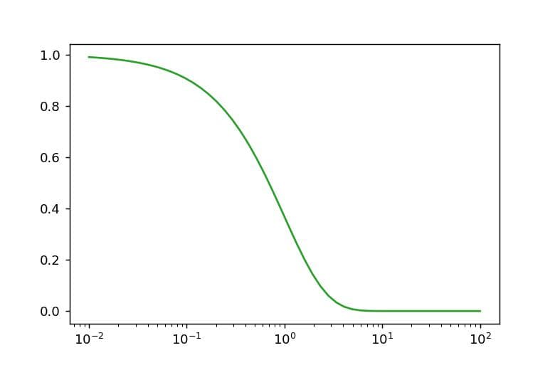
データの作成
np.logspaceを使用してログスケールで均等に分布したデータを生成し、これをxとします。その後、exp(-x)を適用することで指数関数的に減衰するデータを作成します。
作成したデータの図を表示
データを表示すると以下のようになります。
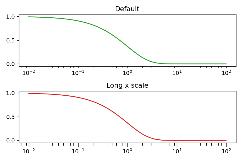
目盛りの長さを変更
set_xscale(“log”)を使用するとx軸がログスケールになり、補助目盛りが表示されます。ただし、この補助目盛りは小さく視認性が低いため、目盛りの長さを調整して見やすくする必要があります。tick_params(axis=”x”, which=’minor’, length=5)のように設定することで目盛りが伸び、視認性が向上します。
axisパラメータで調整する軸(”x”または”y”)を指定し、whichパラメータで主目盛り(”major”)または補助目盛り(”minor”)のどちらを調整するかを選択できます。
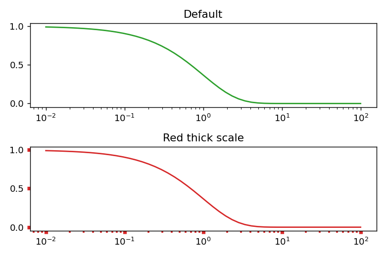
目盛りの幅と色の調整
ax.tick_paramsで、幅はwidthで、色はcolorで調整できます。
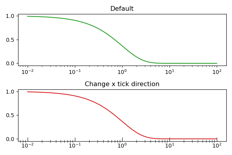
目盛りの方向を指定
directionで目盛りの方向を変えることができます。”in”とすると内側になり、”inout”とすると内側と双側の両方に表示される。外側だけの時は”out”とします。
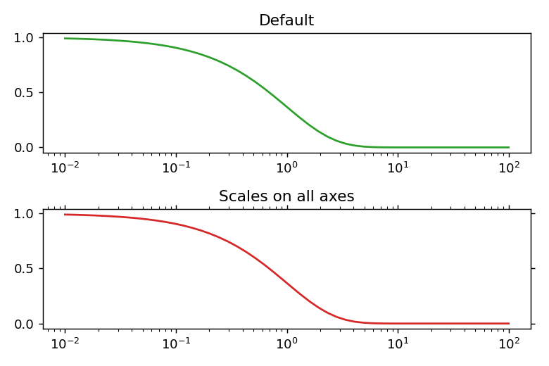
目盛りを全ての軸に表示
tick_paramでbottom=True, top=True, left=True, right=Trueとすることで各軸に目盛りを表示できます。非表示にしたいときはFalseとします。
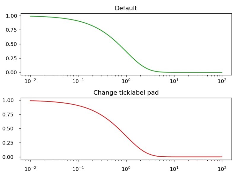
軸と軸ラベルの距離を変更する
ax[1].tick_params(pad=10)にようにpadで調整できます。
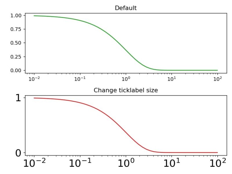
軸ラベルのサイズを変更する
labelsizeで変更でき、”large”とかも使えます。
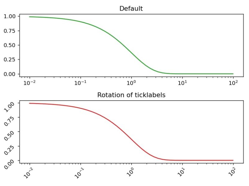
軸ラベルの回転
labelrotationで角度を指定することで回転できます。
参考


コメント