はじめに
本記事では、Pythonのデータ可視化ライブラリであるMatplotlibを用いた箱ひげ図(boxplot)の作成方法について詳しく解説します。箱ひげ図はデータの分布状況や外れ値を視覚的に把握するのに適したグラフであり、四分位数や中央値などの統計量を効果的に表現できます。基本的な使い方から応用例まで、実践的なコード例とともに説明していきます。
コード&解説
基本的な箱ひげ図
データの生成
np.random.randint(1,100,50)は1から99のいずれかの数値を要素とする、要素数50個の配列を生成します。np.ones(25) * 50は全ての要素が50である25個の配列を作成します。同様に、flier_highは101~199の範囲、flier_lowは-99~-1の範囲の要素を持つ配列です。これらの配列はnp.concatenate関数によって一つの配列に結合されます。
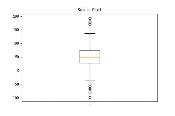
箱ひげ図の表示
ax1.boxplot(data)で箱ひげ図を表示できます。
boxの中央値部分に切り込みを入れる
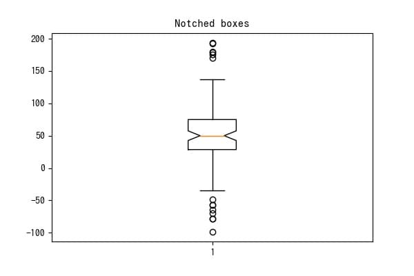
notch=Trueで箱に中央値部分に切り込みを入れることができます。
外れ値のマーカーの設定
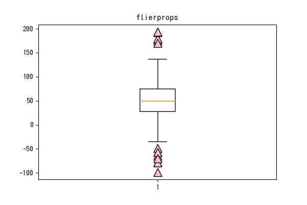
辞書形式でflierpropsを設定することで外れ値の見た目の調整ができます。
外れ値を非表示にする
showfliersによる設定
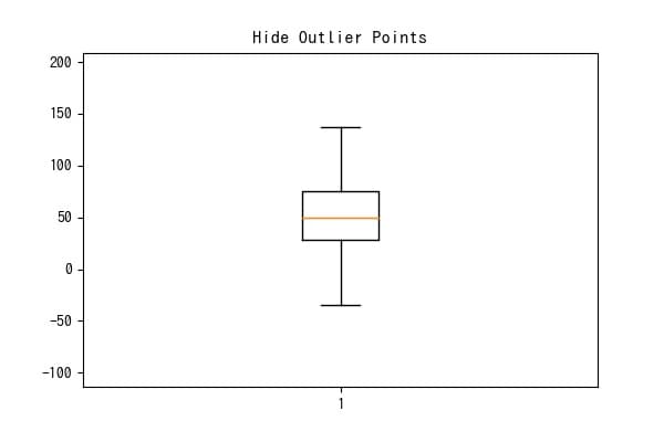
showfliers=Falseで外れ値を非表示にできます。
symによる設定
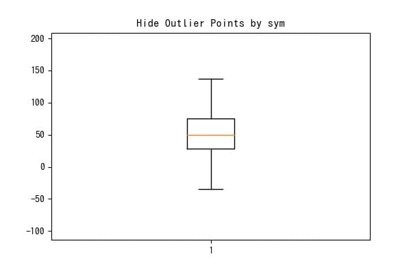
sym=””を設定することでも外れ値を非表示にすることができます。
boxを横にする
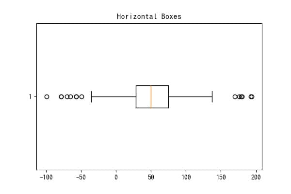
vert=Falseで箱を横向きにすることができます。
ひげの調整
ひげを短くする
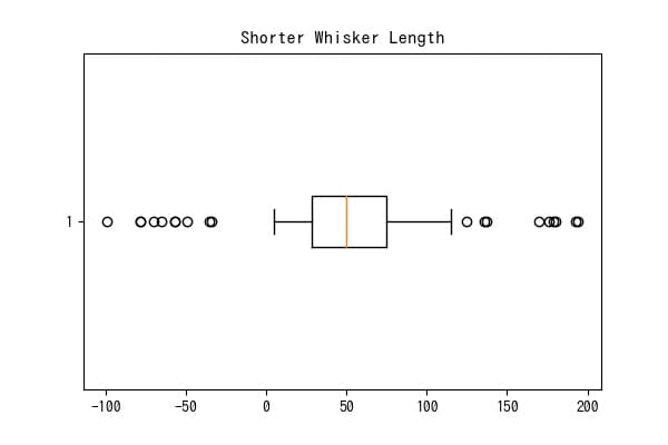
whis=1を設定すると箱の幅1個分離れた値までひげが伸びます。デフォルト値は1.5であるため、この設定ではひげが短くなります。
ひげを長くする
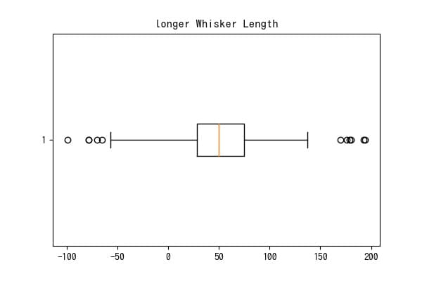
whis=2を設定すると箱の幅2個分離れた値までひげが伸びるため、ひげがより長くなります。
ひげをパーセンタイルで指定
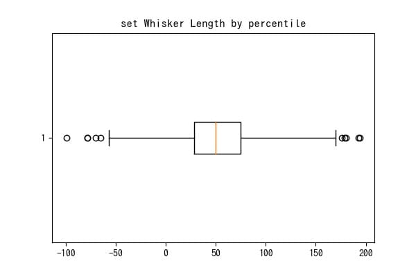
whis=[5,95]のようにすることでひげの長さをパーセンタイルで指定することができます。
複数のboxplotを表示
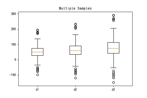
data_ = [data,data2, data3]のようにboxplotしたいデータをリストにして渡すことで複数のboxplotを表示できます。
boxplotの表示位置を変える
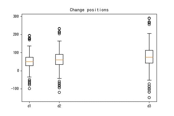
positions=[1,3,9]のようにすることでboxplotを表示する位置を変えることができます。
boxの幅を変える
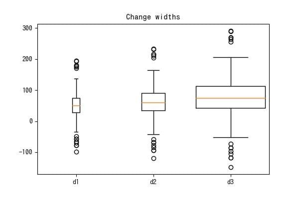
widths=[.1,.3,.9]のようにすることで各boxの幅を変えられます。
算術平均を表示
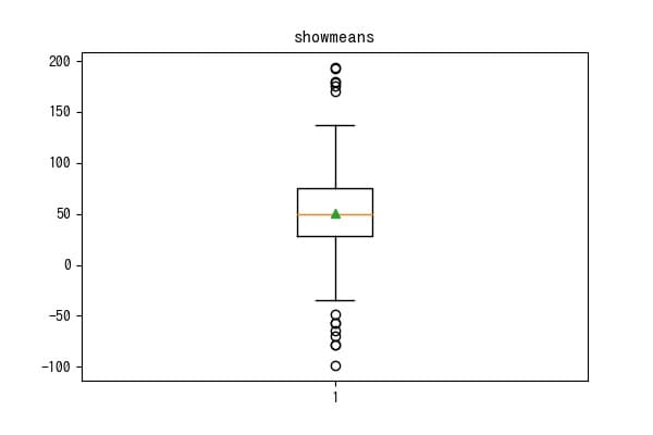
showmeans=Trueで算術平均を表示できます。
中央値の線の設定
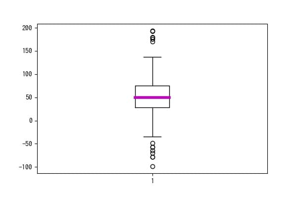
medianprops=medi_styleで辞書形式のmedi_styleを指定することで中央値の線の見た目を変えられます。
参考


コメント