はじめに
データ分析において、変数間の関係性を視覚化することは非常に重要です。seabornライブラリは、このような視覚化を簡単に行うための強力なツールを提供しています。特に、regplotとlmplotは線形回帰モデルを散布図上に表示するための優れた関数です。
コード
解説
モジュールのインポートなど
seabornなどのversion
データの読み込み
2017-2019のサッカーJリーグのJ1の結果を下記サイトから読み込みます。URLごとにTableをDataFrameとして読み込み、読み込んだものをリストに加えていきます。

DataFrameへの列の追加と結合
各データフレームに[‘year’]の列を追加します。
pd.concatでリスト内のデータフレームを結合します。結合したDataFrameの上位5行は以下のようになります。
| 順位 | Unnamed: 1 | Unnamed: 2 | 勝点 | 試合数 | 勝 | 分 | 敗 | 得点 | 失点 | 得失 | 平均得点 | 平均失点 | year | |
|---|---|---|---|---|---|---|---|---|---|---|---|---|---|---|
| 0 | 1 | NaN | 川崎フロンターレ川崎F | 72 | 34 | 21 | 9 | 4 | 71 | 32 | 39 | 2.1 | 0.9 | 2017 |
| 1 | 2 | NaN | 鹿島アントラーズ鹿島 | 72 | 34 | 23 | 3 | 8 | 53 | 31 | 22 | 1.6 | 0.9 | 2017 |
| 2 | 3 | NaN | セレッソ大阪C大阪 | 63 | 34 | 19 | 6 | 9 | 65 | 43 | 22 | 1.9 | 1.3 | 2017 |
| 3 | 4 | NaN | 柏レイソル柏 | 62 | 34 | 18 | 8 | 8 | 49 | 33 | 16 | 1.4 | 1.0 | 2017 |
| 4 | 5 | NaN | 横浜F・マリノス横浜FM | 59 | 34 | 17 | 8 | 9 | 45 | 36 | 9 | 1.3 | 1.1 | 2017 |
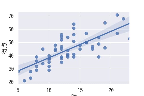
regplotの表示
x軸に”勝”データ, y軸に”得点”データをプロットし、線形回帰が表示されます。
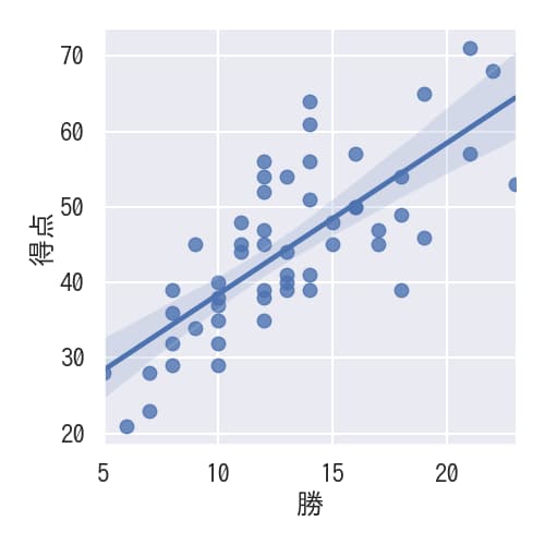
lmplotの表示
regplotと同様の線形回帰つき散布図がlmplotによっても表示されます。
regplotとlmplotの違い
regplotはSeriesやnumpy配列を引数として受け付け、そのままプロットを表示できますが、lmplotはDataFrameのカラム名を指定する必要があります。Seriesを渡すと、「TypeError: Invalid comparison between dtype=int64 and str」というエラーが発生します。
jitterで散布図の位置をずらす
x_jitter=0.2などの値を設定することで散布図の点を微妙にずらし、重なっている点の数を容易に確認できるようになります。このずらし効果は線形回帰分析の結果には影響しません。
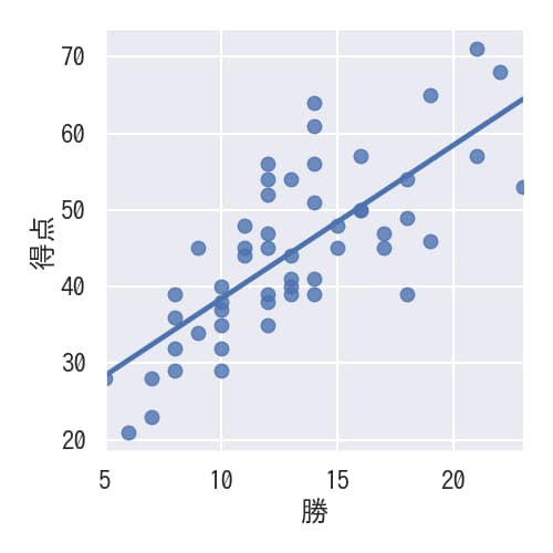
x_estimator=np.meanで平均値を表示
x_estimator=np.meanを設定すると、散布図の個々のポイントの代わりに各x値における平均値がプロットされます。

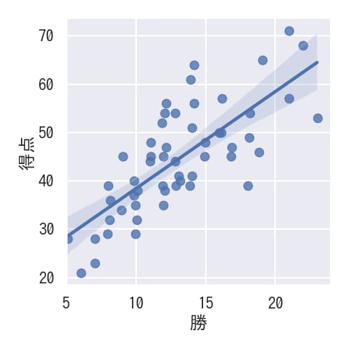
ci=noneで信頼区間を非表示にする
ci=noneで透明な青い部分として示されている信頼区間を非表示にすることができます。
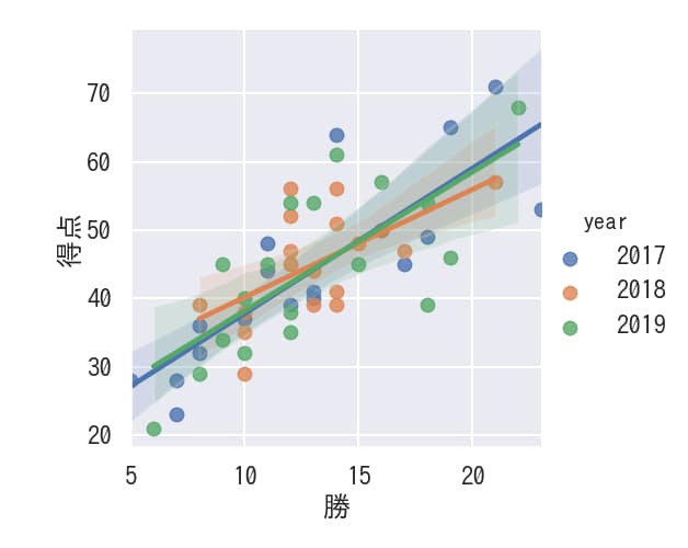
hueで色によるデータの分離
hue=”year”とすることで年ごとに色を分けて散布図と線形回帰を表示できます。
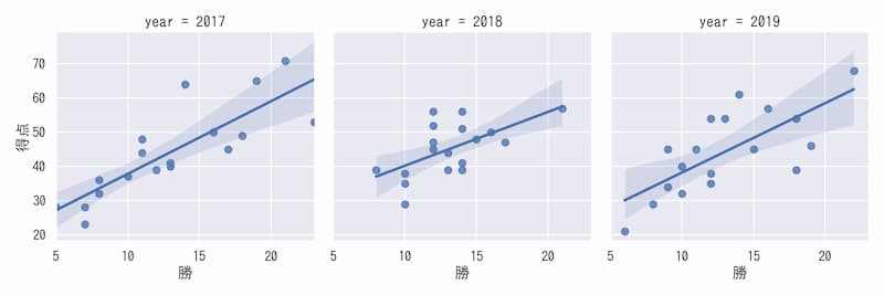
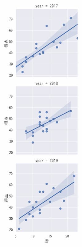
col,rowで各データを複数グラフで表示
col=”year”とすることで横並びの図で各年の線形回帰つき散布図を示せます。
row=”year”とすることで縦並びの図で各年の線形回帰つき散布図を示せます。
まとめ
seabornのregplotとlmplotは、データ分析において変数間の関係性を視覚的に理解するための強力なツールです。単純な線形回帰から複雑な条件付き分析まで、様々なシナリオに対応できる柔軟性を備えています。
regplotはシンプルさと直接的な制御を提供する一方、lmplotはより複雑な分析のためのFacetGridベースの機能を提供します。分析の目的や複雑さに応じて、適切な関数を選択することが重要です。
これらの関数を活用することで、データの理解を深め、より洞察に富んだ分析結果を得ることができるでしょう。
参考


コメント