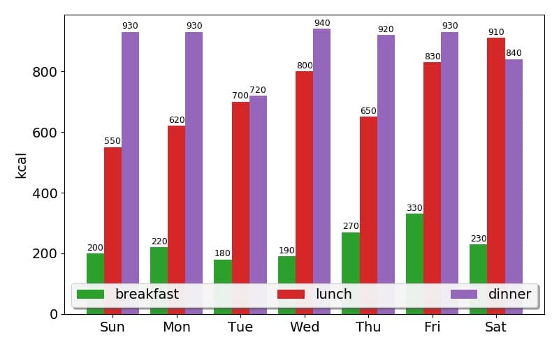
Loading [MathJax]/jax/output/HTML-CSS/config.js

[matplotlib] 56. plt.barによる集合棒グラフ

matplotlib

はじめに

matplotlibのplt.barで集合棒グラフを表示する方法について説明する。また、棒の上にデータを表示する方法についても説明する。

コード

%matplotlib inline
#集合棒グラフ
import matplotlib
import matplotlib.pyplot as plt
import numpy as np
plt.rcParams['font.family'] = 'sans-serif'
plt.rcParams['font.size']=14
#make data
labels = ['Sun', 'Mon', 'Tue', 'Wed', 'Thu', 'Fri', 'Sat']
breakfast = [200, 220, 180, 190, 270,330,230]
lunch = [550, 620, 700, 800, 650,830,910]
dinner = [930, 930, 720, 940, 920, 930, 840]
x = np.arange(len(labels)) # the label locations
width = 0.275 # the width of the bars
fig, ax = plt.subplots(figsize=(8,5))
rects1 = ax.bar(x - width, breakfast, width, label='breakfast',color='C2')
rects2 = ax.bar(x , lunch, width, label='lunch',color='C3')
rects3 = ax.bar(x + width, dinner, width, label='dinner',color='C4')
# Add some text for labels, custom x-axis tick labels and legend.
ax.set_ylabel('kcal')
ax.set_xticks(x)
ax.set_xticklabels(labels)
ax.legend(loc='lower left', fancybox=True, ncol=3,shadow=True,mode='expand',framealpha=0.9)
def autolabel(rects):
"""Attach a text label above each bar in *rects*, displaying its height."""
for rect in rects:
height = rect.get_height()
ax.annotate('{}'.format(height),
xy=(rect.get_x() + rect.get_width() / 2, height),
xytext=(0, 1), # 1 points vertical offset
textcoords="offset points",
ha='center', va='bottom',fontsize=9)
autolabel(rects1)
autolabel(rects2)
autolabel(rects3)
fig.tight_layout()
plt.savefig('gropedbarchart.jpg', dpi=100)
plt.show()

解説

モジュールのインポート

import matplotlib
import matplotlib.pyplot as plt
import numpy as np
plt.rcParams['font.family'] = 'sans-serif'
plt.rcParams['font.size']=14

データの生成

#make data
labels = ['Sun', 'Mon', 'Tue', 'Wed', 'Thu', 'Fri', 'Sat']
breakfast = [200, 220, 180, 190, 270,330,230]
lunch = [550, 620, 700, 800, 650,830,910]
dinner = [930, 930, 720, 940, 920, 930, 840]
x = np.arange(len(labels)) # the label locations
width = 0.275 # the width of the bars

3種のデータを用いる。xは棒グラフの生える位置であり、widthは棒グラフの幅となる。

棒グラフの表示

fig, ax = plt.subplots(figsize=(8,5))
rects1 = ax.bar(x - width, breakfast, width, label='breakfast',color='C2')
rects2 = ax.bar(x , lunch, width, label='lunch',color='C3')
rects3 = ax.bar(x + width, dinner, width, label='dinner',color='C4')

棒グラフのxの位置をそれぞれのデータでx – width、x、x + widthとしてずらして表示することで集合棒グラフとする。

軸ラベルの設定と凡例の表示

# Add some text for labels, custom x-axis tick labels and legend.
ax.set_ylabel('kcal')
ax.set_xticks(x)
ax.set_xticklabels(labels)
ax.legend(loc='lower left', fancybox=True, ncol=3,shadow=True,mode='expand',framealpha=0.9)

set_ylabelでy軸のラベルを設定し、set_xticksでx軸の目盛りの位置を設定し、set_xticklabelsでラベルをセットする。
ax.legendで凡例を表示する。凡例の設定方法については下記で説明した。

[matplotlib] 8. 凡例
matplotlibでは、凡例をplt.legend()またはax.legend()で表示できる。ここでは、その設定方法について説明する。

カラーバーの表示と目盛りの設定

def autolabel(rects):
"""Attach a text label above each bar in *rects*, displaying its height."""
for rect in rects:
height = rect.get_height()
ax.annotate('{}'.format(height),
xy=(rect.get_x() + rect.get_width() / 2, height),
xytext=(0, 1), # 1 points vertical offset
textcoords="offset points",
ha='center', va='bottom',fontsize=9)
autolabel(rects1)
autolabel(rects2)
autolabel(rects3)

このコードにより、各棒の上端のすぐ上にテキストを表示する。各棒の高さは、get_heightで取得する。ax.bar()であるrects1は

rects1
#<BarContainer object of 7 artists>

であり、各棒それぞれの高さを取得するには、for文で展開する必要がある。

for rect in rects1:
height = rect.get_height()
print(height)
'''
200
220
180
190
270
330
230
'''

ax.annotateの'{}’.format(height)で高さデータがテキストで表示されるようになる。
xyは各棒の上端の座標であり、x座標と棒の幅はget_xとget_widthで取得できる。

for rect in rects1:
print(rect.get_x())
'''
-0.41250000000000003
0.5874999999999999
1.5875000000000001
2.5875
3.5875
4.5874999999999995
5.5874999999999995
'''
for rect in rects1:
print(rect.get_width() / 2)
'''
0.1375
0.1375
0.1375
0.1375
0.1375
0.1375
0.1375
'''

xytext=(0, 1)とtextcoords=”offset points”により、xyの1ポイント上にテキストが表示される。

コードをダウンロード(.pyファイル)

コードをダウンロード(.ipynbファイル)

参考

Grouped bar chart with labels — Matplotlib 3.1.2 documentation

コメント