はじめに
この記事では、matplotlibを使用してグラフのx軸とy軸のラベル位置を調整する方法について解説します。set_xlabelとset_ylabelメソッドのloc引数を利用して、ラベルの配置をカスタマイズする方法を、実践的なコード例とともに紹介していきます。
コード
解説
モジュールのインポート
バージョン
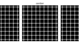
データの生成と表示
データの生成は下記記事と同様に行いました。
[matplotlibで錯視] 3. きらめき格子錯視
Pythonのmatplotlibライブラリを使用して、視線を動かすと黒い点がちらつくように見える「きらめき格子錯視」を作成する方法を解説。コードの実装手順やパラメータ調整方法を詳細に説明します。
sabopy.com
2019.02.26
ラベルの位置の調整
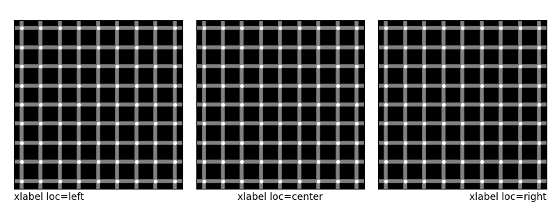
図のラベルを表示するにはset_xlabel関数を使用します。
locパラメータに’left’、’center’、または’right’を指定することで、ラベルの位置をそれぞれ左寄り、中央、右寄りに調整できます。
ylabelの位置を調整
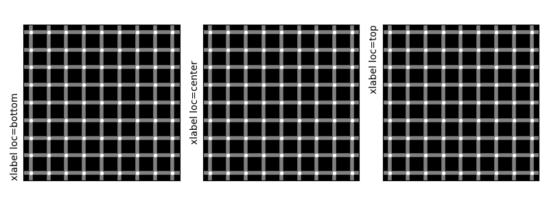
y軸のラベルはset_ylabelで設定します。locパラメータに’bottom’、’center’、’top’を指定することで、y軸ラベルの位置をそれぞれ下寄り、中央、上寄りに調整できます。
labelと図の間の間隔を調整
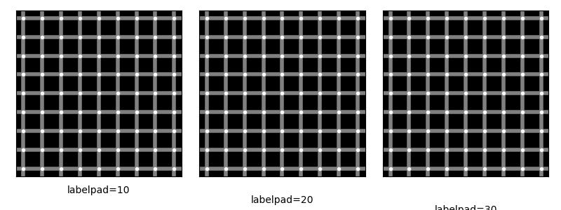
ラベルと図の間の間隔は、set_xlabelメソッドのlabelpadパラメータを設定することで調整できます。
まとめ
matplotlibのset_xlabelとset_ylabelメソッドにloc引数を使用することで、軸ラベルの位置を簡単に調整できます。これにより、グラフの見た目を向上させ、より見やすく情報を伝えるデータビジュアライゼーションが可能になります。
loc引数は、特に複数のサブプロットを含むグラフや、特定の情報に注目させたいグラフで非常に便利です。適切なラベル配置を選ぶことで、データの理解がしやすくなり、プレゼンテーションの質が向上します。
参考

What's new? — Matplotlib 3.3.0 documentation
matplotlib.org

matplotlib.axes.Axes.set_xlabel — Matplotlib 3.10.9 documentation
matplotlib.org
タイトルの位置の調整
タイトルの位置の調整については、下記記事で解説しました。
[matplotlib] 63. タイトルの位置の調整方法
matplotlibでグラフにタイトルを追加する方法と、中央・左・右揃えなどの水平位置や垂直位置、パディングの調整方法について解説します。サンプルコードでそれぞれの設定方法を具体的に示しています。
sabopy.com
2020.03.11
コメント