はじめに
この記事では、matplotlib の plt.scatter 関数を使って散布図を作成し、データポイントに色分けを適用して、それを説明する離散的なカラーバーを表示する方法を解説します。
コード
解説
モジュールのインポートなど
バージョン
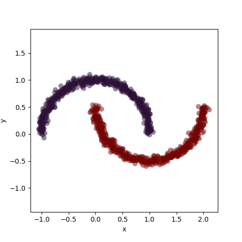
データの生成
sklearnの
datasets.make_moons関数を使用して、三日月状の分布を持つクラスタリングおよび分類用のデータを生成します。この関数の詳細は下記記事で解説しています。生成されたデータでは、Xに座標値が、yにラベル値が格納されます。
[scikit-learn] 4. 三日月状データを生成:make_moons関数の使い方
scikit-learnのmake_moons関数を使った三日月状データの生成方法を解説。パラメータ設定によるデータ分布の変化について詳しく説明します。
sabopy.com
2021.01.11
図示すると以下のようになります。
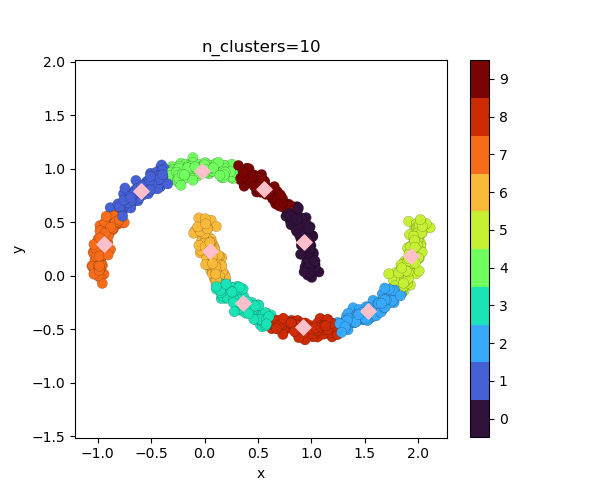
KMeansによるクラスタリング
クラスター数を10に設定し、k平均法によるクラスタリングを実行します。y_10_は各データポイントのクラスタリング結果(ラベル)を表します。
離散的カラーバーのための準備
レベルを設定します。値がレベルの範囲内に収まるように全体から-0.0001を引いています。BoundaryNormを使用してレベルに基づき、カラーマップのインデックスを生成します。
離散的カラーバーつき散布図の表示
ax.scatter() 関数では norm=norm を設定します。
各クラスターの中心点は ax.scatter(fit_10.cluster_centers_[:,0], fit_10.cluster_centers_[:,1]) で表示できます。
カラーバーは plt.colorbar(p, ticks=np.arange(10)+.5) で作成し、目盛りの値が各カラーの中央に配置されるよう +0.5 を加えています。これらの目盛りの値は cbar.ax.set_yticklabels() で設定できます。
コードをダウンロード(.pyファイル) コードをダウンロード(.ipynbファイル)参考


matplotlib.pyplot.colorbar — Matplotlib 3.3.4 documentation
matplotlib.org

KMeans
Gallery examples: Bisecting K-Means and Regular K-Means Performance Comparison Demonstration of k-means assumptions A de...
scikit-learn.org
コメント