はじめに
データ分析において、データの分布を視覚的に把握することは非常に重要です。seabornライブラリでは、distplotとkdeplotという関数を使って、ヒストグラムとカーネル密度推定(KDE)プロットを簡単に作成することができます。本記事では、これらの関数の基本的な使い方と応用例を紹介します。
コード
解説
モジュールのインポートなど
データの読み込み
3月8日から10日にかけての京都と鹿児島の気象データを下記サイトから取得して使用します。

DataFrameの結合
pd.concatでデータフレームを結合します。
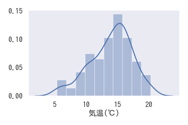
気温データをヒストグラムを描写するデータとして用います。
ヒストグラムの表示
sns.distplot(x)を使用すると、xのヒストグラムを作成できます。このコマンドはヒストグラムと共にカーネル密度推定グラフも同時に表示します。
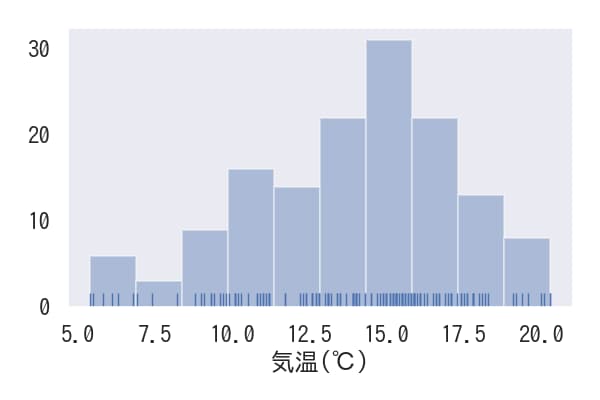
KDE非表示にしラグを表示
kde=Falseを設定するとカーネル密度推定グラフが非表示になります。また、rug=Trueを設定すると横軸下部にデータの値に対応した棒が表示されます。
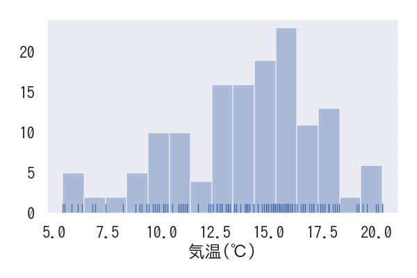
ヒストグラムのbin数の変更
ヒストグラムのbin(区間)の数は、binsパラメータで指定することで変更できます。
ヒストグラムをnormalize
ヒストグラムの累計値を1にするには、norm_hist=Trueパラメータを設定します。
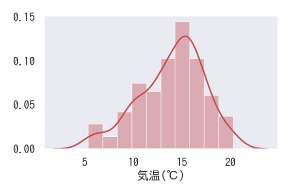
色の変更
パラメーター
color=”r” を使用すると、グラフの色を赤に変更できます。
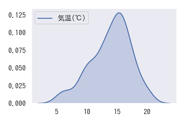
カーネル密度推定グラフのみを表示
kdeplotを使用することでカーネル密度推定グラフのみを表示できます。また、shade=Trueといったパラメータを設定することで、グラフの外観をカスタマイズすることも可能です。
KDEplotのデータを取得
kdeplotに対して.get_lines()[0].get_data()メソッドを適用することで、プロットされているデータを取得できます。
コードをダウンロード(.pyファイル) コードをダウンロード(.ipynbファイル)まとめ
seabornのdistplotとkdeplotは、データの分布を視覚的に理解するための強力なツールです。ヒストグラムはデータの頻度を表示し、KDEプロットは滑らかな分布曲線を提供します。これらを組み合わせることで、データの特性をより深く理解することができます。特にデータサイエンスの初期段階における探索的データ分析(EDA)において、これらのプロットは不可欠なツールとなります。
参考


コメント