はじめに
3D円グラフは、通常のパイチャートを3次元空間に表示したものです。しかし、データ可視化の専門家からは、3D円グラフは以下の理由から推奨されていません:
- 視覚的な歪みによりデータの比較が難しくなる
- 奥行きの表現により前面のセグメントが強調され、データの誤った解釈を招く
- 2Dの円グラフで十分な情報を伝えられる場合が多い
それでも、特定の状況では視覚的な効果として使用したい場合があるため、この記事ではmatplotlibを使用した3D円グラフの作成方法を解説します。
コード
解説
matplotlibにおける3D円グラフについて
matplotlibには3D円グラフを作成する専用機能が実装されていません。そこで、Wedgeパーツを手動で3Dグラフに配置することにより、3D円グラフを実現しています。
データの生成
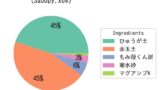
データは下記と同様にオリジナルサボテン用土の配合比となっています。
[matplotlib] 30. みやすい円グラフ
matplotlibで作成する円グラフの視認性と情報伝達力を向上させるための実践的なテクニックを解説。凡例の追加、パーセンテージ表示、セグメントの強調、カラーパレットの設定など、データ可視化を最適化するための具体的な方法を紹介しています。
sabopy.com
2019.03.29
Wedgeの角度を直接設定する必要があるので、データの合計が360になるようにします。
円グラフの設定
円グラフの中心座標を(0.5, 0.5)、半径を0.5に設定します。色については、Qualitative colormapsのset2から0番目から5番目までの色を使用しています。

color example code: colormaps_reference.py — Matplotlib 2.0.2 documentation
matplotlib.org
Wedgeでは、中心(center)、半径(r)、開始角(theta1)、終了角(theta2)および色(color)を設定します。
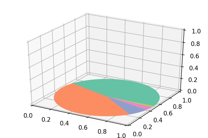
3D円グラフの表示
最初にax.add_patch(w1)で3DグラフにWedgeを追加します。
次にart3d.pathpatch_2d_to_3d(w1, z=0, zdir=”z”)を使用して、z=0のxy平面上にWedgeを配置します。
ax.axis(“off”)で3Dグラフの軸を非表示にしています。
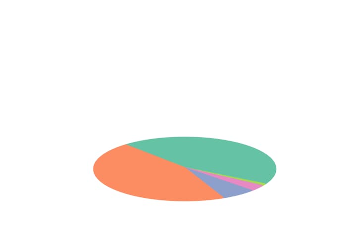
軸を表示すると以下のようになります。
参考


https://oku.edu.mie-u.ac.jp/~okumura/blog/node/2266
oku.edu.mie-u.ac.jp
[matplotlib] 30. みやすい円グラフ
matplotlibで作成する円グラフの視認性と情報伝達力を向上させるための実践的なテクニックを解説。凡例の追加、パーセンテージ表示、セグメントの強調、カラーパレットの設定など、データ可視化を最適化するための具体的な方法を紹介しています。
sabopy.com
2019.03.29
[matplotlib 3D] 11. 3Dグラフ上に円、線、面などの図形を表示する方法(pathpatch3d)
matplotlibの3Dグラフに円や線、面などの2次元図形を3D空間に投影する方法を解説。pathpatch3dモジュールを使って2Dのパスオブジェクトを3D空間に配置する手法を紹介し、視覚的に豊かな3Dグラフ表現を実現する方法を説明します。
sabopy.com
2018.11.25

matplotlib.patches.Wedge — Matplotlib 3.1.2 documentation
matplotlib.org

Draw flat objects in 3D plot — Matplotlib 3.1.0 documentation
matplotlib.org
コメント