はじめに
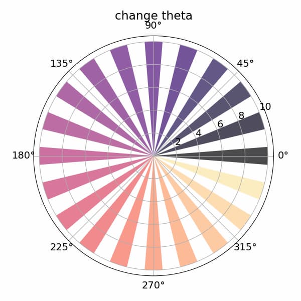
この記事では、Pythonのmatplotlibライブラリを使用して極座標系での棒グラフ(polar bar chart)を作成する方法について説明します。極座標棒グラフは、通常の直交座標系ではなく、角度と半径を使って表現するグラフで、周期的なデータや方向性のあるデータの可視化に適しています。
コード
解説
モジュールのインポートなど
バージョン
データの生成
np.linspace(0, 2*np.pi, N)を使用して0から2πまでのN個の等間隔な配列を作成します。そして、thetaの値に応じて色が変化するようにcolorsを設定します。
極座標棒グラフの表示
極座標グラフを作成するには、plt.subplot(111, projection=’polar’)でaxを設定します。その後、ax.barメソッドを使用して極座標系の棒グラフを表示できます。
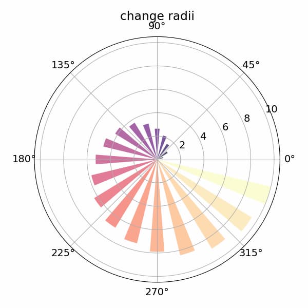
radiiを変化させた場合
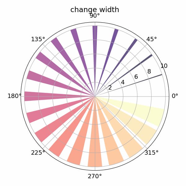
widthを変化させた場合
参考

Bar chart on polar axis — Matplotlib 3.2.1 documentation
matplotlib.org

matplotlib.projections — Matplotlib 3.2.1 documentation
matplotlib.org
コメント