はじめに
matplotlibではグラフの見た目を簡単に変更できるスタイル機能を使って、Excelのような見た目のグラフを作成する方法を解説します。自作スタイルの定義方法から適用手順まで、ステップバイステップで説明していきます。
[matplotlib] 1. plotの見た目を変えるスタイルの設定
Pythonのmatplotlibライブラリでグラフの見た目を変更するスタイル設定について解説。デフォルトスタイルの変更方法、カスタムスタイルの適用、色やフォントの調整など、データ可視化をより効果的に行うためのテクニックを紹介します。
sabopy.com
2019.02.07
コード
解説
configフォルダの場所の確認
matplotlib.get_configdir()を使用してconfigフォルダの場所を確認できます。これは隠しフォルダのため、表示されない場合はOSの設定で表示するよう変更する必要があります。
確認したconfigフォルダ内のmatplotlibフォルダにstylelibフォルダを作成し、そこにスタイルファイル(.mplstyle)を配置します。
styleの作成
フォントサイズ、軸、凡例などの設定を以下のように記述し、stylelibフォルダに保存します。
このファイルは下記ボタンからダウンロードできます。
コードをダウンロード(.mplstyleファイル)styleの適用
ファイル名をexcel.mplstyleとしているため、「plt.style.use(‘excel’)」で設定が適用されます。
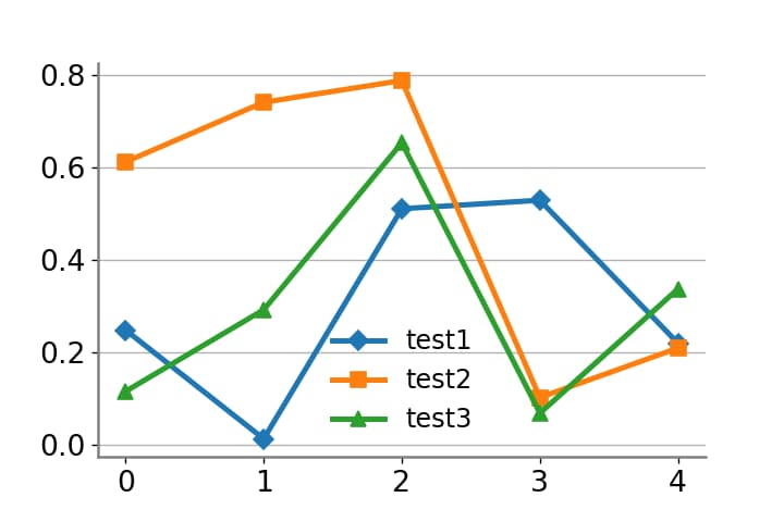
図の表示
下図のように、Excelのような図が表示されるようになります。
まとめ
matplotlibのスタイル機能を活用することで、Excelライクな見た目のグラフを簡単に作成できます。自作スタイルの定義と適用方法を理解すれば、データ可視化の幅が広がります。
参考

https://matplotlib.org/tutorials/introductory/customizing.html?highlight=style%20sheets#customizing-matplotlib-with-style-sheets-and-rcparams
matplotlib.org

https://matplotlib.org/tutorials/introductory/customizing.html?highlight=style%20sheets#the-matplotlibrc-file
matplotlib.org

コメント